First, a little context
About FYERS
FYERS is an Indian discount broker. People use it to trade equity, derivatives and mutual funds across web, mobile and the Trader terminal.
Overview
Internally the programme was called FYERS First. The brief from the growth team was one line: build a membership that keeps existing customers and brings new ones in. Everything else — what you get, what it costs, where people find it, what happens when they don't buy it — was open.
I owned the membership experience end to end: the public landing page, the nudges scattered across the product, the Prime pages inside the profile, the subscription journey, and the design of what sits behind the paywall for everyone who doesn't subscribe.
My role
End-to-end product design — discovery, flows, UI, prototypes, and handoff across web and app. I worked from the PRD with the product owners and took the design decisions on scope, hierarchy and gating.
Team
- Sanjeevini & Abhimanyu Product owners
- Growth Product stream
- Web, App & Backoffice Engineering
- Role
- Product Designer 2 — end-to-end
- Platform
- Web, App, Trader terminal
- Scope
- Marketing site → checkout → benefits
- Year
- 2025
Goals
- Retention. Give existing customers a reason to consolidate their trading on FYERS instead of splitting it across brokers.
- Acquisition. Make membership attractive enough that new customers subscribe within their first months.
- Make the value legible. Brokerage savings, higher limits and premium analytics are abstract until you see them against your own usage.
- Keep the free tier honest. Gate features without making the basic product feel broken or bait-and-switch.
Context
A discount broker makes money per order, so a membership is an odd fit: you're asking active traders to pay up front for cheaper trading later. The maths only works for people who trade often — and those are exactly the customers most likely to keep accounts at two or three brokers at once.
That framed the whole project. Prime had to read as consolidate here and you come out ahead, not as a toll gate on features people already had. Two numbers would tell us whether it landed: how many existing customers subscribed, and how many new customers subscribed within three months of opening an account.
The membership had to pay for itself in the customer's head before they reached the payment screen.The design constraint
The brief
The PRD broke into five surfaces, each with its own design problem:
- A public landing page — what Prime is, the full feature list, a benefits comparison, yearly pricing, and discount handling. Three audiences on one page: guests, basic users and existing members, each needing a different call to action.
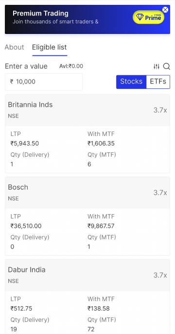
- Touchpoints across the product — banners and nudges wherever a Prime benefit is relevant: MTF, orders, options analytics, markets, menu, home. Each one needed a before-membership and an after-membership state.
- Prime pages inside the profile — one for people deciding, one for people who just paid, and one for members tracking what they've used: trades left out of their brokerage-free quota, upcoming webinars, partner subscriptions.
- The subscription journey — a single yearly plan for V1, GST-inclusive pricing, launch discounts, coupon codes, auto-renewal on by default, and a mandate created through the existing funds system.
- Feature gating — baskets, alerts, screeners, custom watchlists, AI prompts, options automations and three premium analytics reports, each with a limit for basic users and an overlay when they hit it.
What was hard
Gating a product people already use
The limits weren't theoretical: plenty of basic users already had more than ten custom watchlists or twenty-five saved screeners. Taking those away would have been a straight downgrade, so existing items had to be grandfathered and the limit applied only to new ones — and the overlay had to explain that difference in a sentence, at the moment someone hit it.
Coupons versus mandates
A coupon reduces what you pay today, but the auto-renewal mandate still has to be created for the full price so next year's renewal works. That mismatch is invisible to the business and alarming to a customer reading their bank's SMS. It needed saying plainly on the payment screen rather than hiding in the T&Cs.
No cancellation in V1
The honest constraint: V1 shipped without an in-app cancel flow — subscriptions had to be managed through the payment platform or the bank. Designing a "Manage subscription" page that is upfront about that, instead of quietly omitting it, was the uncomfortable part.
Final design
The spine of the design is one idea: show the benefit where the benefit applies. Rather than one loud paywall, Prime appears as a contextual nudge at the moment a feature matters — and converts into a status cue once you're a member.
Nudges that become badges
Every touchpoint has two states. Before membership, a banner frames the specific saving in that context — brokerage-free orders where you place orders, a better MTF slab on the MTF screen. After membership, the same slot carries the Prime mark instead of a pitch, so the product stops selling and starts confirming.
Benefits you can watch yourself use
The members' page isn't a feature list — it's a usage tracker. Trades used against the brokerage-free quota, partner subscriptions claimed, webinars coming up. The job of that page is to make the renewal decision obvious a year later, which means the value has to be visible monthly.
One plan, no maths at checkout
V1 deliberately ships a single yearly plan. Pricing is GST-inclusive, discounts show as a struck-through original, coupons apply inline, and the mandate amount is stated before you pay rather than discovered afterwards.
A membership you can see
The Prime mark sits next to the username with validity underneath, and members get an exclusive theme — which quietly reverts to the default when a subscription lapses. Support tickets carry the same badge, so priority routing is real rather than advertised.
Impact
Prime is a net-new programme, so there was no baseline to beat. Success is tracked against two metrics from the PRD, plus the dashboards built alongside the launch:
- Retention — subscribers who were already FYERS customers.
- Acquisition — subscribers who joined within three months of opening an account.
- Behaviour — login frequency, order volume and feature usage before versus after subscribing, and how fast members work through their brokerage-free quota.
Live numbers land after launch — drop them in here once the first monthly review is out.
Next steps
- More than one plan, once there's data on who subscribes and what they actually use.
- In-app subscription management and cancellation, closing the V1 gap.
- More partner perks, with a cleaner claim flow than voucher codes.
- Tuning each gate against the number of users who hit it daily — some limits will be too tight, some too generous.